Interior Design Tips: Color Influence in Store Design
Interior Design is an important factor in making customers buy your products, from window display, products arrangement to lighting. But one of the basic yet the most important aspect in Interior Design that sometimes got neglected, is color. The factor that influence customers the most is the visual, it’s the most used sense for normal people and one of the most persuasive aspect in visual is color.
There are many kinds of color. Each of them can invoke a different emotion and make people do different action. Below are the examples of some color that people used the most:
Red is the most “attention-grabbing” color. When you see the products at the grocery aisle in the supermarket, most of the products will have a red label. To announce sales, red color is a must because it can grab the customers’ attention easily.
Unfortunately, red is not a good color to have in excess. It’s an aggressive color that has been proven to be able to raise blood pressure and increase respiration rates, so if people keep seeing red color, they will easily get anxious and angry. Too much red can have a negative impact to a Retail Business because of those reasons stated above, so it’s not recommended to paint whole store in red color.
Pink is a happy, romantic, light-hearted color. It’s also one of the soothing color alongside green and blue. It’s also the color that most people consider cute, especially girls. But there is something about this color most people don’t know.
There was once a study conducted on dangerous prisoners. When the prisoners were locked in a cell with pink walls, the color calmed them – for about 20 minutes. After that, the color made the prisoners more violent than before they entered that pretty pink cell.
One thing that we must not forget is that, pink can be considered a mellowed red color, so the characteristic of red is still there, but only made largely unnoticeable.
Green is calming and refreshing, the color of nature. A popular color in home décor, studies have shown that green is relaxing and the easiest color on the eye. It is suitable for skin care store, relaxing-theme cafe or furniture store. That being said, be careful of using too much dark green in your store décor; it’s too easily equated with money. You want customers to shop in peace, not be concerned with the money they are about to spend. So to avoid this, use natural green color and not the color of money.
Orange is the color of energy. It can make people happy, arouse their enthusiasm and overall positive effect on people. It’s not as attention-grabbing as red, but it also can be considered an attention-grabbing color. Too many of orange color is also not good, especially if it’s bold orange color. On the other hand, a soft orange color is more tolerable in large doses so it’s a color often used as a wall-paint.
Yellow is an optimistic color. It’s warm and cheery – the color of the sun. Have you ever wondered why legal pads are yellow? The color is supposed to help with concentration. We see yellow before we see any other colors. It’s especially effective when used with black, that’s why “Caution” and other important signs use this color combination. But too much of yellow can be hard for the eyes, causing fatigue or agitation – not good for quilters. And there are plenty of studies that show babies cry more in yellow rooms.
Brown signifies warmth and security. It’s a stable, dependable, down-to-earth color. Lately, brown has moved uptown, becoming all the rage in home décor and fashion – we’re seeing a lot of products in combinations of brown and pink, and brown and teal. Various shades of brown in leather and wood have always been popular choices for store fixturing.
Blue is the color of maturity and calmness. It’s a popular color for working clothes because it signifies loyalty and confidence. On a side note, many important people on TV wear blue for this exact reason. Blue is often used in office settings because studies show people are more productive when surrounded by it. It’s also said to lower your pulse rate. Blue is commonly used in airplane décor because of its calming qualities. And hospitals rely on light blue to help with healing and to invoke feelings of tranquility.
Purple is a rare color that doesn’t happen too often in nature. Perhaps that’s why it’s widely considered the color of royalty. Purple is typically used to symbolize luxury, wealth and sophistication. That’s why you usually see purple got combined with gold color in interior design decoration.
White is clean and bright. It’s used to portray light and purity. White has been referred to as the absence of color and also the color of perfection. While it’s a good primary color, it’s hard to take when used all by itself. There used to be a designer shoe store in Las Vegas that was done entirely in white. From the outside the store glowed, and the merchandise really stood out. Inside, the décor was too stark and too bright. It took a few moments for your eyes to adjust, not exactly a good thing when the goal is to make customers spend quality time in the store.
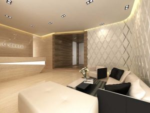
You may use white as the main color of your shop, for example, your wall. Then add decorations to the wall; lay a unique flooring like cement screed flooring or wooden flooring; you can even play the lighting to make the wall not so striking like what we have done for Little Flower boutique shop.
Black is at the other end of the spectrum. It’s been described as the presence of all color and it’s an attention grabber, but in a different way than red color. Black is best described as “Elegant” and can invoke the feeling of admiration, so it’s a very popular color to use in prestigious things. For example, when people go to an important and prestigious event, they will likely use a black-colored car compared to other colors. The same goes for suits, executive employee will usually wear a black color suit when they go to a meeting.
Black can really makes merchandise pop; that’s why it’s a favorite décor choice in electronics stores. It can make a space seem smaller, the same way a black suit can make you look slimmer. Black is a good color to paint a high ceiling. By making the ceiling almost disappear, the space becomes more intimate.
So, Which Color is The Best for Interior Design?
There is no such thing as perfect color. There are different colors for Interior Design for different situations. It all depends on many circumstances, like for example, what kind of things you plan to sell, what kind of customers you’re aiming at, how is the situation around your store, etc. This article already give you the basic knowledge on how to use color effectively, the rest is up to you. Mix and match the color to get the most appropriate one for your Store Interior Design, ask other people for their opinion, and arrange your merchandise correctly to get maximum benefit out of this tips.